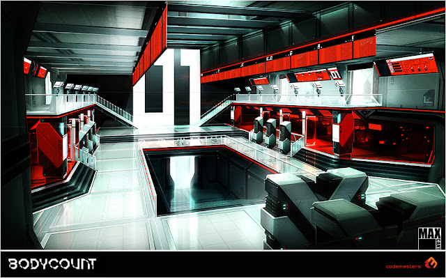
TARGET structures were mainly designed to be telescoping underground bunkers and machine towers, which I named MECHALITHS when I was designing them. They are called NEXUS' in the game.
 |
TOWER deployed under building 2 in the Military Compound stage. I painted this quite early on and it was the basis for several other designs. |
 |
This was a design I produced to investigate the chevron banding and machine elements I wanted to see in to the interiors. |
 |
I painted up a number of interior surfacing and architecture guides for the environment artists. This one shows an 8m high column made of two column components clipped together. |
 |
I had the idea to use our glass tech system to panel the walls of the TARGET interiors. This image shows my pre-visualisation for how the interiors would look after a shootout. |
 |
I was very keen to get extremely bold red interiors in the game: these can be seen in reactor rooms. |


No comments:
Post a Comment