 |
| Add caption |
An old concept image but one I still like.

Personal concept work. Still WIP: pending lighting and atmospheric effects.


 |
TOWER deployed under building 2 in the Military Compound stage. I painted this quite early on and it was the basis for several other designs. |
This image shows the theme of bands of tone or colour I wanted to get into the interiors to break up forms. This totalitarian style was inspired by the Naval dazzle camouflage of Sir Norman Wilkinson from WW1. |
 |
Large computer and command rooms broke up corridors and gantry systems provided overhead combat options. This room's ceiling was inspired by mid-century modern design, and the architectural work of Louis Kahn. |
 |
This was a design I produced to investigate the chevron banding and machine elements I wanted to see in to the interiors. |
 |
I painted up a number of interior surfacing and architecture guides for the environment artists. This one shows an 8m high column made of two column components clipped together. |
 |
I had the idea to use our glass tech system to panel the walls of the TARGET interiors. This image shows my pre-visualisation for how the interiors would look after a shootout. |
 |
I was very keen to get extremely bold red interiors in the game: these can be seen in reactor rooms. |
I worked with the graphic design company 'ROSIE LEE' providing framing and external feedback on the logo design. |
 |
KEY ART - WE DID THIS IN ABOUT 10 DAYS. I DID MOST OF THE MAIN PAINTING WITH SUPPORT FROM CHARACTER AND CONCEPT DEPARTMENTS. |
 |
This was my first environment painting on the project. I wanted to investigate colour and surfaces. It's the African City Streets (minus the propping and debris passes). It was based on a french colonial look rather than a more modern style. |
 |
I painted this in about 3 days flat out. It shows the Pirate Bay stage. |
 |
I worked on this Mine painting with Rasmus Jorgensen. I set the composition and colour work. Ras did the underpainting and character sourcing etc and then I did an overpaint later to bring it in line with the other marketing paintings. I added a lot of smoke and debris and a new grade. |
 |
This was another 3-4 day painting and it shows the Asian Fishing Slum, which I also drew up the plans for, and directed the gameplay and aesthetic propping passes on. I really loved working on this piece, even thought time was tight. |
 |
This is another shot I worked on with Ras, it shows a view of the Ice House in the Asian Fishing Slum stage. |
 |
I worked on this with vincent Jenkins, I set the composition and lighting info. Vinny worked up the main body of the shot and then I polished it up for print. |
 |
OFFICIAL XBOX COVER IMAGE. I directed this image across the character, concept, guns and marketing departments and did clean up onthe character render, gun render and border. |
 |
This is EDGE cover we were on.  This was the art used for the EDGE cover. The model was produced by the character art team, and I did the paint over.  |
 |
Stairs at E3 2011. It turned out well. Our machines were struggling to handle an image this size. Great fun to see it in person. |
 |
This piece was a personal idea based on WW2 just continuing, and the allies being fought back after a German 'BOMB' was perfected and used. I wanted it to look dusty and ruined as if they were arriving some years later to survey their handywork. |
 |
Created for a competition, where the goal was to redesign a classic cartoon character. 14 days work. |
 |
This was a study in detail and weight and weathering. I was thinking of construction vehicles and Running Man's 'LAST YEARS WINNERS' when I painted it. |
 |
This was a vehicle concept I was working on based on Vietnam photogrpahy and tilt-shift vtol vehicle concepts. It's mostly built in Maya over roughly10 days and has minor post-tweaks in Photoshop. It remains W.I.P. 2005 |
 |
I'd been thinking about how seaguls bank and swoop and wanted to draw a vehicle that had two free articulated wings so it sould scoop air and turn in impossible arcs. |
 |
There's not really a narrative to this piece. I just liked the idea of a big simple robot being fascinated by an innocent creature doing something it didnt understand (eating). I was thinking about 'OF MICE AND MEN' |
 |
| This piece was for a personal project (ongoing) where WW2 just keeps going like in 'THINGS TO COME' by H.G.WELLS. I thought of German P.O.W. women being trained as long range snipers to stem the Red Wave because of dwindling manpower. There would have been some dark blackmail type motivation employed to coerce them |
 |
I had this idea about a scorching hot dusty day somehwere in the middle east, with giant inert robots keeping the 'peace'. |
 |
This was speculative work for Clive Barker. It was for JERICHO before it was signed and I had the idea of making Vatican Guards into ceramic armoured spec-ops guys. |
 |
Literally a flight of fancy, this clunky armoured French paratrooper was for a game idea I had been looking at for a few years, again based on the idea of a war (WW1) simply continuning. |
 |
I made this cover up over a day or so, it was just an idea based on playing with language and typography. It was produced in 2004 and I liked the idea of robot guns sat on top of buildings they'd claimbed up to get a better shot at airborn agressors. I was thinking of Appleseed then. |
 |
This was a quick poster I made up for a friends band. It used an oil paiting I had done years back for an art school project. I still reall liked the colours, and I'm pretty certain I had the cover for the 'WATCHMEN' in the back of my mind. 2003 |
 |
| KLEET AND GATOR - TOON |
 |
| KLEET AND GATOR - STYLISED HEAVY METAL |


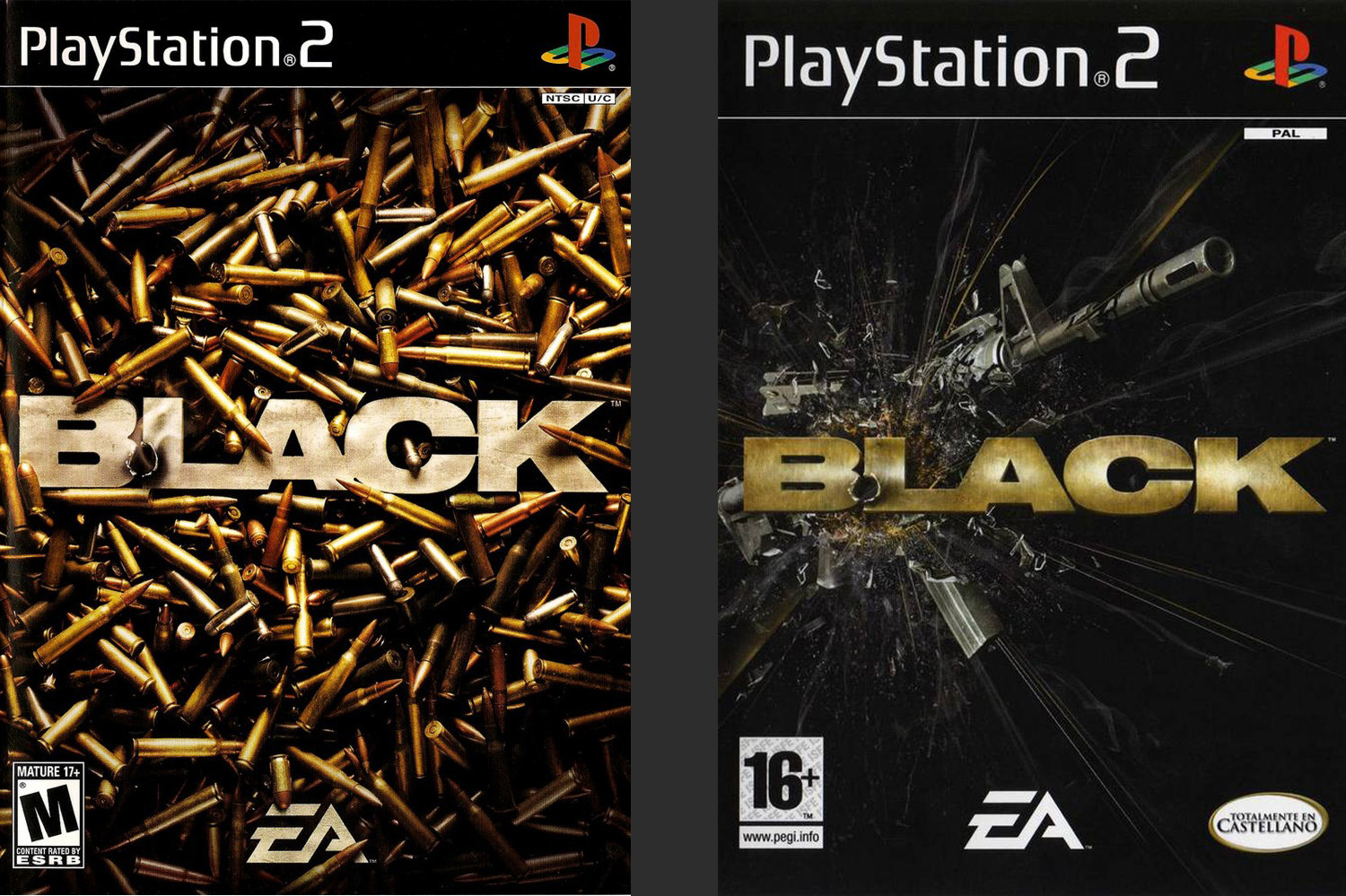 |
| The U.S. release cover is on the left, the U.K. release cover is on the right, I contributed modeling work to the logos. |


 |
| This was the final room in Foundry stage. I loved the big smelter towers and the crane. You can see there was a lot of glass. |


